“`html
How to Read Crypto Exchange Charts: A Guide for New Users
Hey there! If you’re new to the world of cryptocurrency, staring at those charts on a crypto exchange platform can feel like decoding an ancient language. Believe me, I’ve been there—confused, a little overwhelmed, but curious enough to learn. Over time, reading crypto exchange charts became one of my most valuable skills. It’s like having a map in the wild west of digital currencies.
This guide is all about helping you make sense of those charts. By the end, you’ll not only understand what they show but also how to use that info to make smarter trading decisions. No jargon-heavy nonsense—just clear, practical advice.
Why Understanding Crypto Charts Matters
Charts are essentially the heartbeat of any crypto exchange. They tell you what’s happening with a coin’s price, volume, market trends, and sometimes even help predict future moves. Without reading charts, you’re basically flying blind.
Trading crypto isn’t just “buy low, sell high” — it’s about timing, spotting trends, and managing risk. Charts are your best tool for that. Plus, the more you understand them, the more confident you’ll feel when making trades.
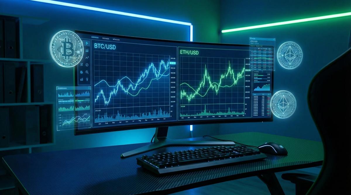
Getting to Know the Basics: What Are Crypto Exchange Charts?
At their core, crypto charts are visual representations of price activity over time. Exchange platforms like Binance, Coinbase, and Kraken use several types of charts, but the most popular by far is the candlestick chart. I find candlesticks way more insightful than simple line charts because they show more details about the price action.
Understanding Candlestick Charts
Each candle on the chart represents a specific time period — say, 1 minute, 1 hour, or 1 day. Here’s what each candle tells you:
- Open: The price when the candle period starts.
- Close: The price when the candle period ends.
- High: The highest price during that period.
- Low: The lowest price during that period.
The candle body shows the range between the open and close prices. If the close is higher than the open, the candle is usually green (or white)—meaning the price went up. If the close is lower, the candle is red (or black)—meaning the price went down.
Think of it as a quick summary of market sentiment during that timeframe: buyers in control or sellers pushing the price down.
Other Chart Types You Might See
Besides candlesticks, some platforms offer:
- Line charts: These simply connect closing prices over time. Good for beginners but lack the detail of candlesticks.
- Bar charts: Similar to candlesticks but with a different visual style.
- Heikin Ashi: A variation of candlesticks that smooths price action and helps identify trends.
For most beginners, I recommend focusing on candlestick charts first—they strike the perfect balance between simplicity and depth.
Key Elements to Watch on Crypto Exchange Charts
Once you’re comfortable identifying candlesticks, the next step is to watch for patterns and indicators that give you clues about the market.
Volume: The Unsung Hero
Volume shows how much of a coin was traded during a candle’s timeframe. High volume usually means strong interest and can validate price moves. For example, if a price jumps on low volume, it might be a weak signal. But if the price jumps on high volume, that’s usually more meaningful.
Support and Resistance Levels
Support is a price level where a coin tends to find buying interest and stop falling. Resistance is a price where selling pressure tends to cap upward moves. Identifying these levels helps you anticipate potential bounce backs or reversals.
I often draw horizontal lines on my charts marking previous highs and lows. It’s amazing how often prices respect these levels.
Trend Lines and Moving Averages
Trend lines show the overall direction of price — are we in an uptrend, downtrend, or sideways? Simple moving averages (SMAs) calculate the average price over a period (like 50 or 200 days) and smooth out the noise. When prices stay above the moving average, it’s often a bullish sign; below, bearish.
Here’s a quick comparison of common moving averages:
| Moving Average | Timeframe | Use | Typical Signals |
|---|---|---|---|
| MA 20 | Short-term | Captures recent price action | Quick trend changes |
| MA 50 | Medium-term | Smoother trend confirmation | Used for entry/exit signals |
| MA 200 | Long-term | Overall market direction | Bullish above, bearish below |
How to Start Practicing Reading Charts
My first real breakthrough was when I started applying what I learned on a demo account. Many crypto exchanges offer this feature, letting you trade with fake money to test your skills risk-free. For example, Binance and Bitfinex have solid demo platforms [1].
Try setting the chart to different timeframes and watch how the candlesticks form. Pay attention to volume spikes, see how price reacts near support or resistance, and experiment with adding moving averages.
It also helps to keep a simple trading journal: note down what patterns or signals you see and what decisions you took. Over time, you’ll spot recurring setups.
Recommended Exchanges for Beginners
If you’re ready to jump in and start trading, these exchanges offer beginner-friendly interfaces along with solid charting tools:
- Coinbase: Intuitive UI and educational resources.
- Binance: Advanced charting tools with TradingView integration.
- Kraken: Reliable and secure, with good chart options.
If you want to dive into Binance, sign up here and get an exclusive beginner’s guide to trading on Binance. It’s a great way to start with confidence.
Tips From My Experience
- Don’t try to predict the future perfectly. Charts help you assess probabilities, not guarantees.
- Stick to one or two timeframes. Switching too often can lead to analysis paralysis.
- Combine chart reading with news and fundamentals. Sometimes unexpected events shake the market regardless of chart patterns.
- Keep emotions in check. Fear and greed are the biggest enemies of smart trading.
One personal trick I use is to step away from the screen if I feel anxious. Come back later and look at the chart fresh. Trading should never feel like a rollercoaster ride.
Frequently Asked Questions
1. What timeframe should I use when reading crypto charts?
It depends on your trading style. For day trading, 1-minute to 15-minute charts are common. For swing trading, 4-hour or daily charts work better. Beginners often start with daily charts to get a bigger picture [2].
2. What does “volume” really tell me in crypto trading?
Volume indicates how much of the cryptocurrency was traded during a specific period. High volume often confirms the strength of a price move, while low volume can signal weak or fakeouts [3].
3. Can I rely solely on charts to make trading decisions?
Although charts are powerful, it’s best to combine them with fundamental analysis, such as news, coin utility, and market sentiment. That way, you get a fuller picture.
4. What are “support” and “resistance” in simple terms?
Support is like a floor price that prevents the price from falling further, while resistance is a ceiling price where price struggles to rise beyond. These levels help in making entry or exit decisions.
5. Is it necessary to learn technical indicators right away?
Not necessarily. Focus first on understanding candlesticks, trend lines, and volume. Technical indicators like RSI or MACD can be added once you’re comfortable with the basics.
Ready to Take Your First Step?
If you feel inspired to start practicing chart reading and trading, why not open a real account with an exchange that supports beginner-friendly tools? Sign up for Coinbase here and get started with your first crypto purchase—all with easy-to-read charts and helpful tutorials.
Remember: every expert trader started as a beginner. The more you practice, the better you’ll get. So dive in, stay curious, and keep learning!
References
- Binance – How to Use the Demo Trading Platform
- Investopedia – Time Frame Definition
- Investopedia – Volume in Trading
“`